AgentLine
Viatel · Brand and product design
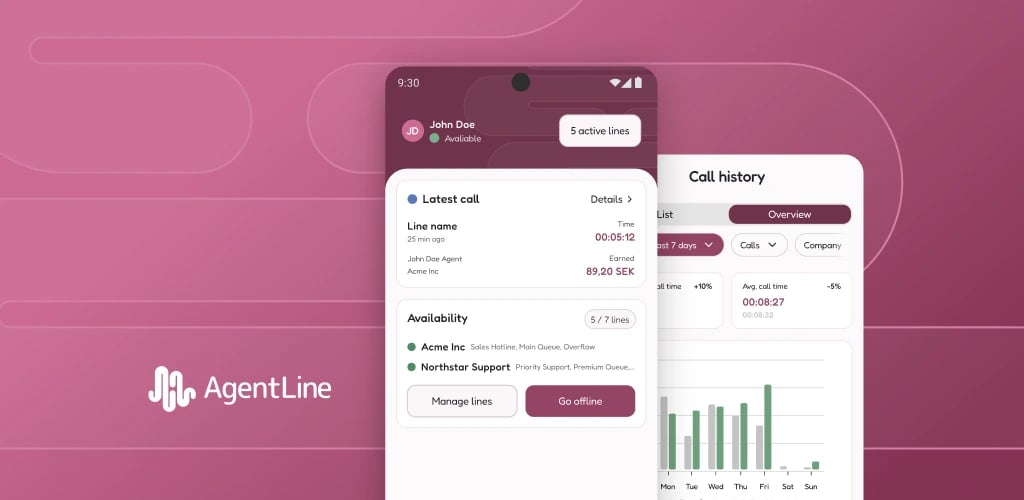
AgentLine brings availability and call management into a mobile app. One person can work with several companies and service lines through the same account. The design needs to make it clear where they are available and what each change will affect.
My work covered the brand and logo, mobile UX/UI, the Figma design system and MASTER file, and launch materials. I worked on the identity alongside the interface and organised the design for continued product development.
Role
Brand and product designer
Product
Mobile UX/UI, onboarding and call management
Delivery
Identity, design system, MASTER and launch assets
One account, several companies
Managing availability used to mean calling a service number, entering a PIN and navigating keypad menus. People working with several companies had to keep track of different lines and their status.
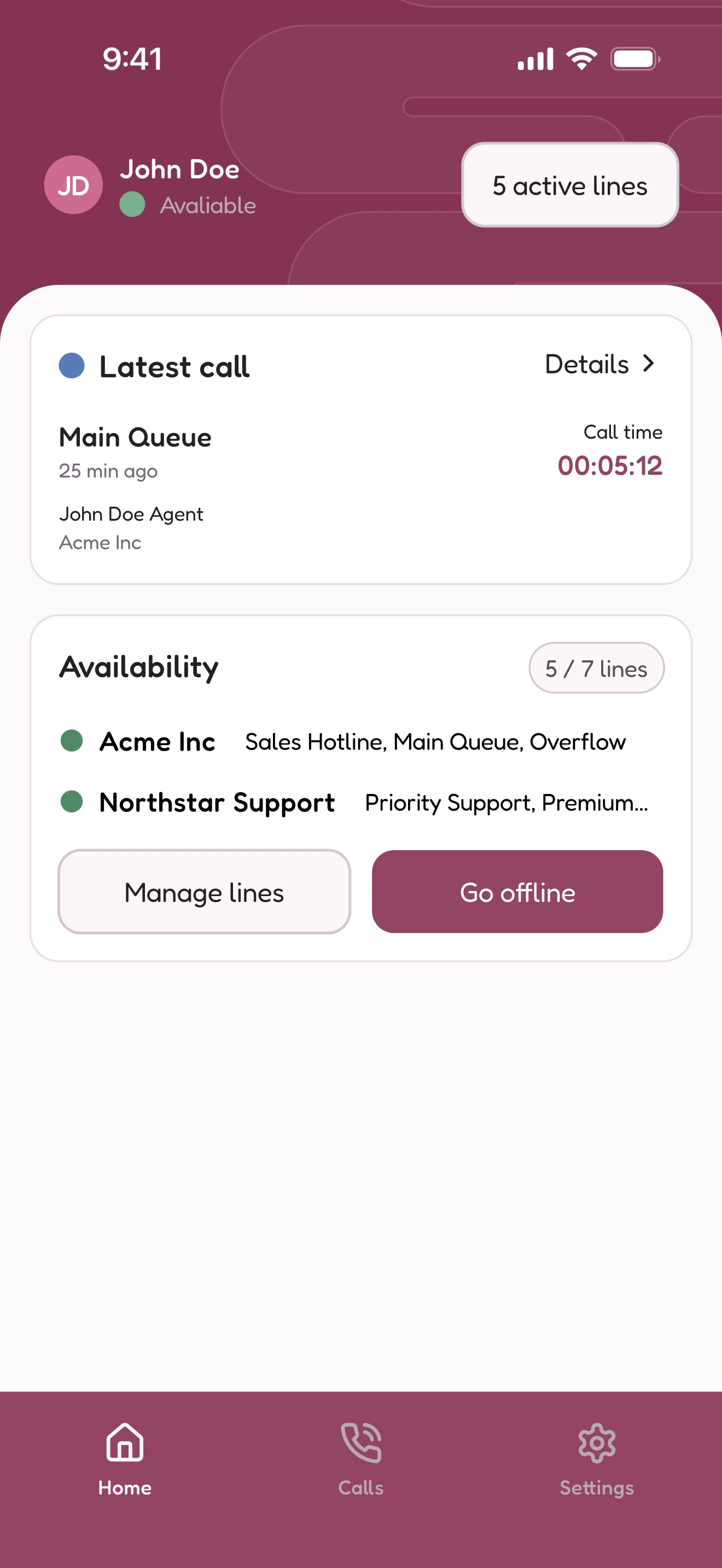
I worked with product, developers and people who knew the telephone flows to bring those actions into the app. A status needs context when someone works across several services. On Home, lines are grouped by company so people can see where they are available.
The same principle applies to warnings. A missed-call count needs to explain which company it concerns and that further missed calls can lead to automatic logout. Showing the consequence is part of the design.
An identity built into the product
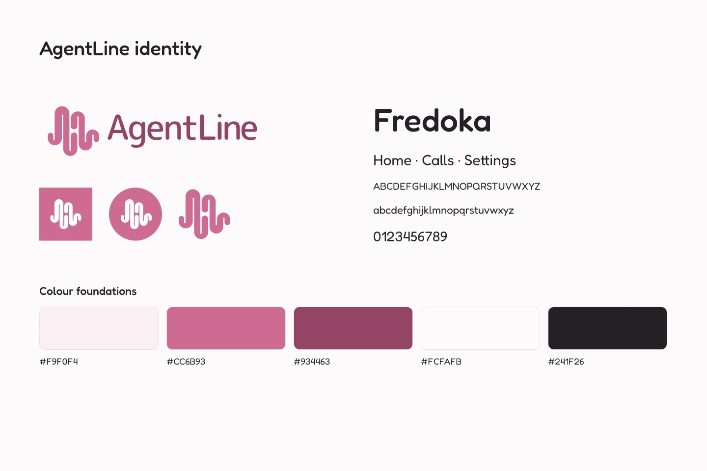
I designed the waveform logo, its variants, the colour palette and typography alongside the interface. The identity had to work as a small app icon as well as a wordmark in launch artwork.
The waveform also became a background pattern. Reusing that shape, the colours and typography connects the app with invitation emails and store listings. Designing those together let me carry the same identity through installation and everyday use.
Components that account for changing content
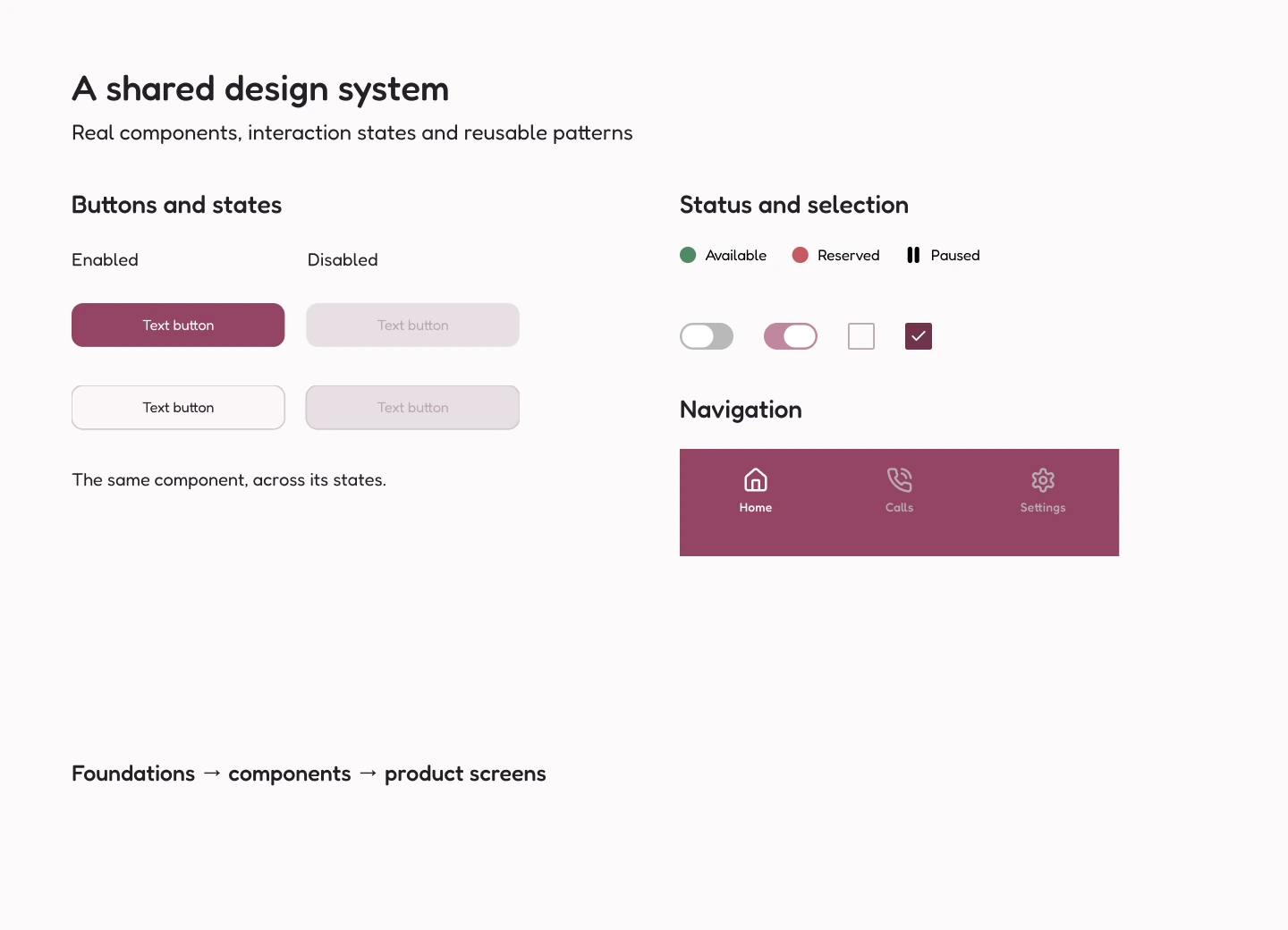
I built the Figma library around the product's foundations, components and interaction patterns. A button includes its enabled and disabled states. Availability has named states. The recording components cover saved recordings, expanded playback and renaming.
I also checked the newer recording components at narrow mobile widths and with longer company names and line lists. Those cases exposed crowded headings and button rows, which I adjusted. Reuse needs to hold up when the content changes.
Showing which companies an edit affects
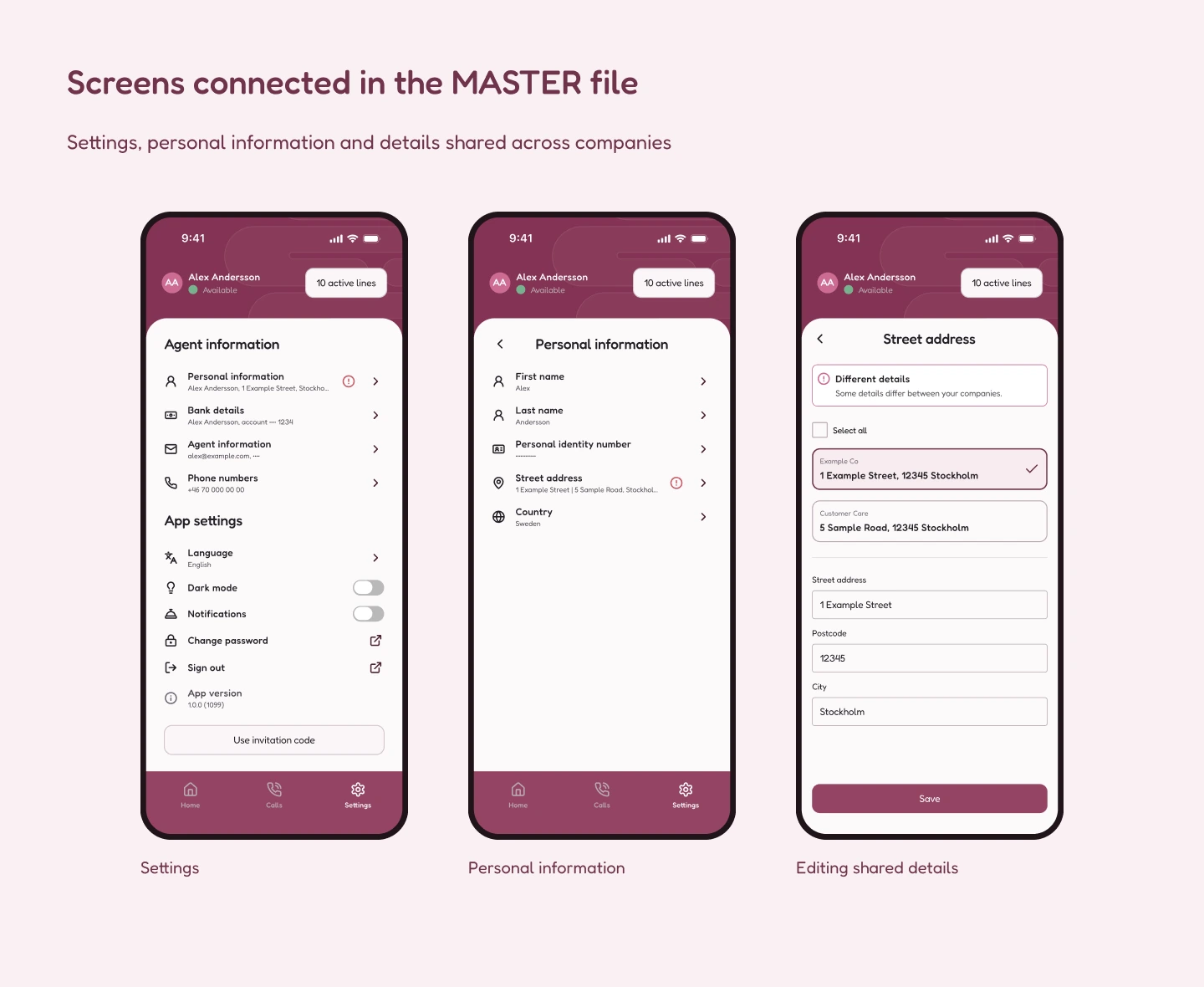
The library defines the reusable parts. In the MASTER file, I brought them together into product screens and connected flows.
Personal information shows why that matters. Someone may work with several companies while sharing details across them. An address edit can therefore affect more than one company. The editing screen lists the companies that share the address, making the reach of the change visible before saving.
Preparing the app for launch
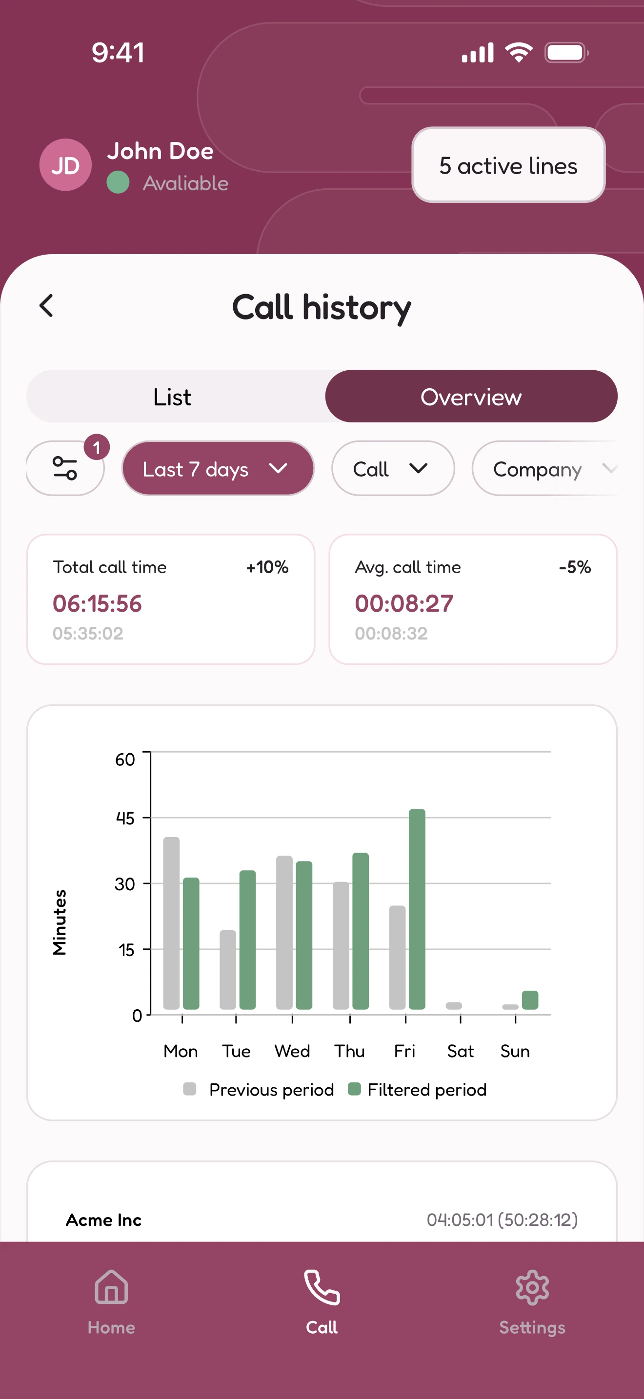
My responsibility continued into app store artwork and assets for invitation emails. The store images show the product's everyday tasks: availability, active lines and call history. They use the same identity and interface that people meet in the app.
Replacing a recording takes an active choice
The recording feature is a more recent example of continuing the product. Someone can record a name, listen back and keep several versions. Saving a sound and choosing where to use it are separate steps.
The important decision is what happens to recordings already in use. The line picker preselects lines missing a recording. Lines with an existing recording stay unselected, so replacing one requires an active choice. The confirmation then names the lines that will change.
That follows the same reasoning as the shared-address flow: show the scope of the change before someone commits to it.
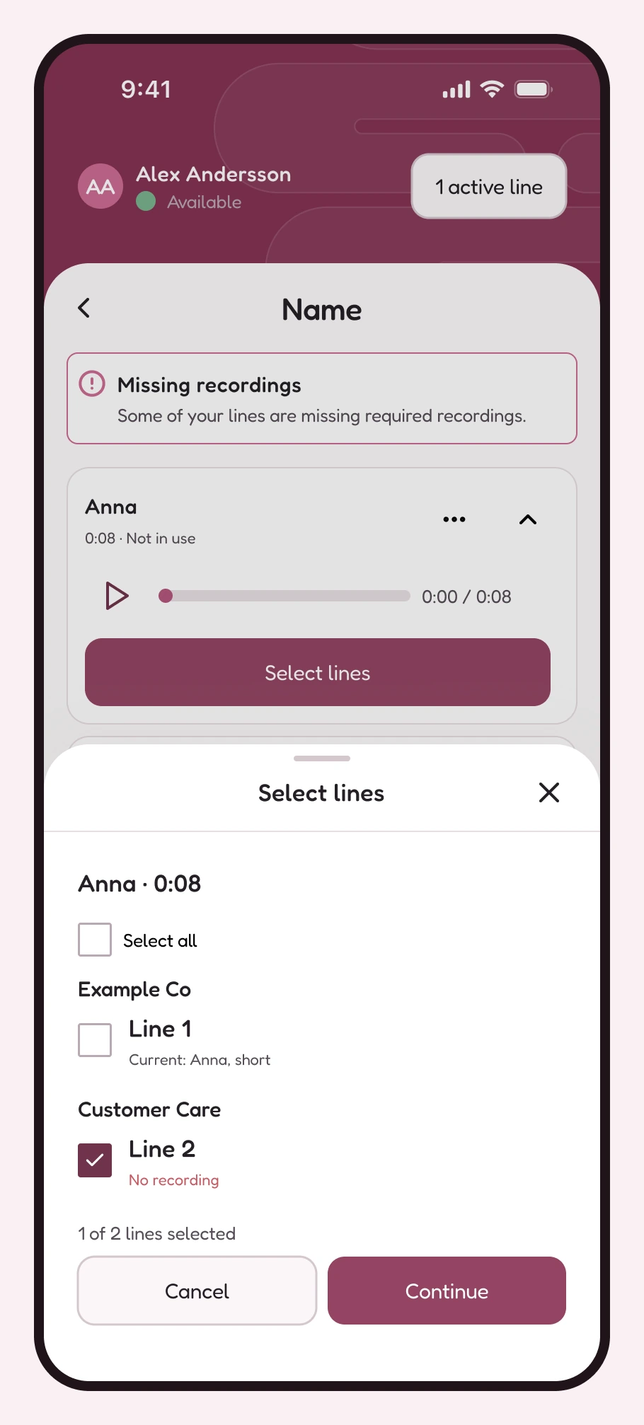
A silent walkthrough of the design, showing a recording applied to two lines that both need one.